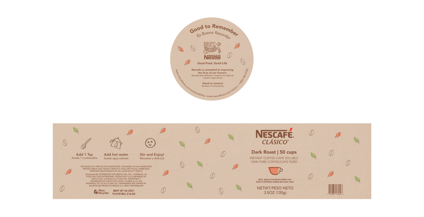
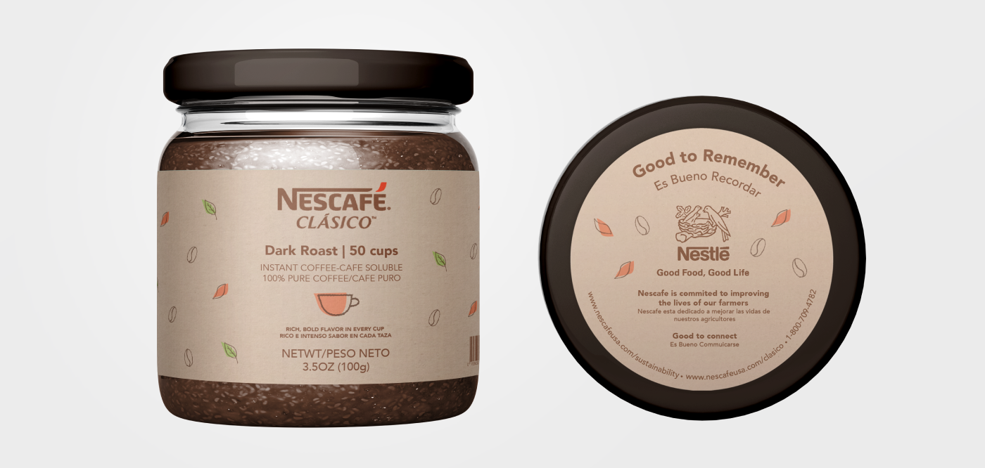
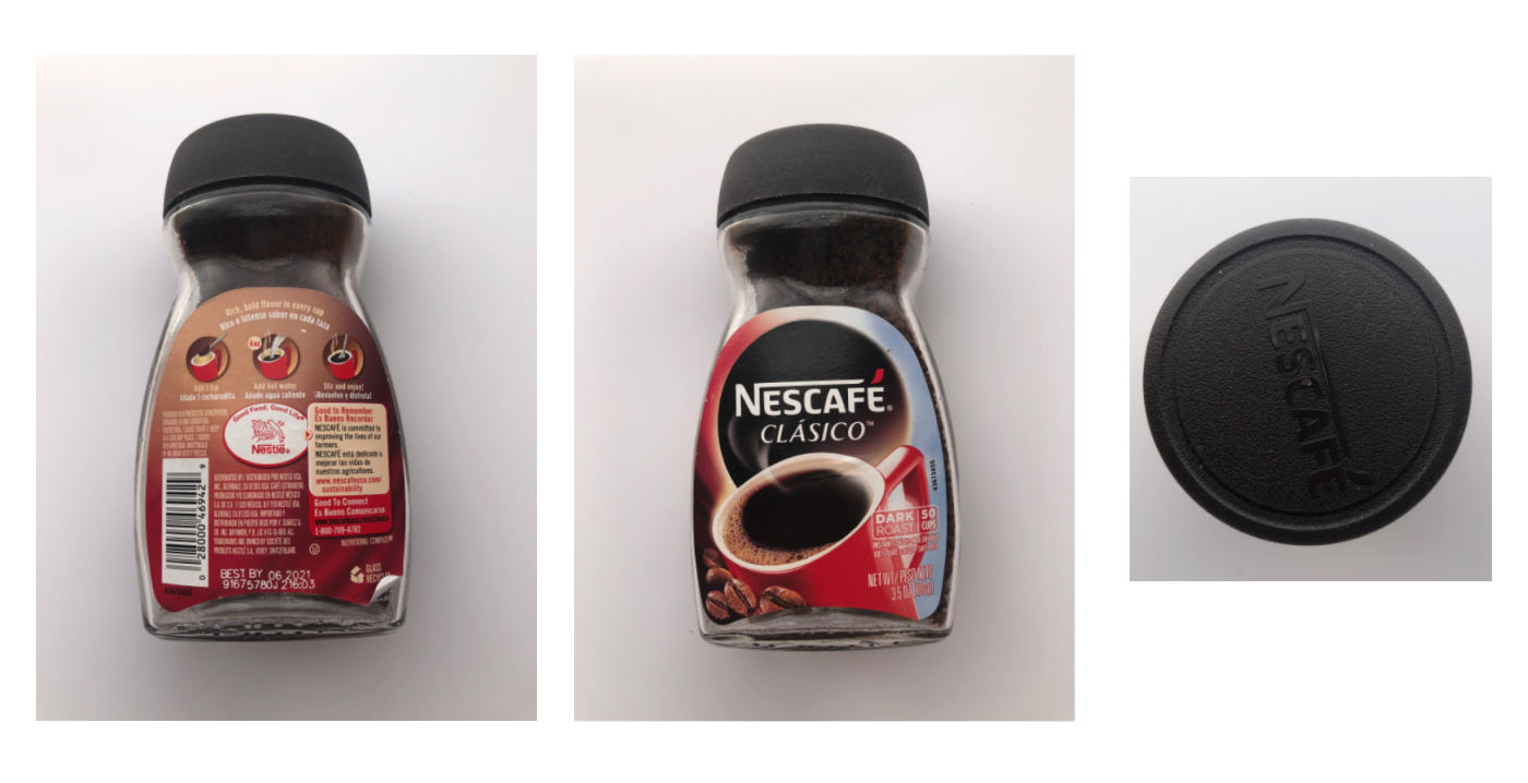
On the original design:
- Bad Hierarchy
- Text is very jumbled together
- Design and colors look outdated
- The gradient looks muddy
- Odd shape for spoon to fit
The redesign
A rustic design approach pushes forth the idea of helping farmers and evokes a welcoming and organic tone.